
Link to IASSIST/CARTO 2018 presentation
Project Background
Between 1957 and 1991 the Alberta Research Council collected a significant amount of meteorological data in Central Alberta. Part of this research involved the collection of information about hail and rainfall in the area; including the frequency and amount of precipitation, storm direction and windspeed, and crop type and damage.
In the 1990’s, the data was identified as being at risk of becoming unusable. The University of Alberta Libraries embarked on a project to preserve the information and place it in a stable data archive. This involved the retrieval of all primary and secondary data sources, which required transferring digital information from magnetic tape to compact disk. The data rescue effort and all the supplementary data and materials were comprehensively documented, becoming the Alberta Hail Project Meteorological and Barge-Humphries Radar Archive.
The complete hail and rainfall datasets are available for download and use from the University of Alberta’s Dataverse, currently in .CSV format. This coding card describes the complete range of data that was collected. The code that parsed the data from .TXT to .CSV is hosted on GitHub.
The visualization below illustrates an example of the way in which the data can be used. The map is pulling information from the hail dataset about the geographical location, date, and maximum observed size of hail stones. This data was provided by area farmers who reported information via mail or telephone between 1957 and 1984. Before making conclusions about the visualizations, it’s important to understand the shortcomings of the data. These include:
- No data was reported between the years 1970-1973, inlcusive.
- The data focus was on Central Alberta, so an absence of markers in some areas does not imply an absence of precipitation.
Zoom in for more detail. The chronological information is on the bottom left of the map (mm/yy).
Making the Map
This map was created using the web-based application CartoDB. When datasets are uploaded into CartoDB, they take the format of SQL tables which can be manipulated and queried to build geographic visualizations. While CartoDB has a lot of great presets for visualizations, what makes the application even more powerful are the customizable options available in the code panels.
Below is the first segment of custom CSS code that stylizes the map. This map uses CartoDB’s Torque function to animate the data. In this map, the visualization is based on three columns of data: the geographical coordinates representing the location of the hail observation, the datestamp representing the date of the hail observation, and the maximum recorded size of the hail (shown below as max_size).
The geographical coordinates are represented by the placement of the dots on the map. The datestamp data is represented by the appearance and disappearance of the blue dots (and can be manipulated using the scroll bar in the bottom left of the map). The max_size data is represented by the size and shade of the blue dots, described in the legend in the bottom right.
Other customizations (shown below) can be controlled by changing the animation-duration, data-aggregation, comp-op, and marker-type. The duration is measured in seconds, set to 60 seconds for this map. The data-aggregation can be set to linear or cumulative, the difference being that the dots remain on the map when set to cumulative and disappear when set to linear. The comp-op affects the appearance of the dots when they touch or overlap other dots, and the marker-type can be set to show circles, squares, or custom icons.
/* Torque Visualization */

Map {
	-torque-frame-count:256;
	-torque-animation-duration:60;
	-torque-time-attribute:"datestamp";
	-torque-aggregation-function:"sum(max_size)";
	-torque-resolution:2;
	-torque-data-aggregation:linear;
	}

#fullhail {
	comp-op: source-over;
	marker-fill-opacity: 0.9;
	marker-type: ellipse;
	}
Below is a continuation of the CSS code used to make the above map. The presets for the Torque visualization set all of the markers to the same size and colour, but these can be modified with more custom CSS. Since the above code identifies the max_size column from the dataset, we can then create custom markers based on the value of max_size. In this case, the data ranges from 1 to 6, with each number representing a different size of hail (as described in the legend).
Each value marker has two pieces of code associated with it. These allow the markers to fade onto the surface of the map, affecting both opacity and size. This effect is controlled by the frame-offset setting, where 1 is the first style of the marker and 2 is the second style. In the first instantiation of each marker, the opacity value is lower and the width is smaller. Both measures increase in the second instantiation. Each marker set has a different colour fill as well. Here they are all in shades of blue, but the markers can be set to any RGB colour.
The final custom element in this map is the legend, described beneath the code box.
/* Legend Customization */

#fullhail[value=6][frame-offset=1] {
	marker-width:12;
	marker-fill: #081B47;
	marker-fill-opacity:0.225;
	}
#fullhail[value=6][frame-offset=2] {
	marker-width:15;
	marker-fill: #081B47;
	marker-fill-opacity:0.85;
	}
#fullhail[value=5][frame-offset=1] {
	marker-width:9;
	marker-fill: #0F3B82;
	marker-fill-opacity:0.225;
	}
#fullhail[value=5][frame-offset=2] {
	marker-width:12;
	marker-fill: #0F3B82;
	marker-fill-opacity:0.85;
	}
#fullhail[value=4][frame-offset=1] {
	marker-width:7;
	marker-fill: #2E5387;
	marker-fill-opacity:0.225;
	}
#fullhail[value=4][frame-offset=2] {
	marker-width:9;
	marker-fill: #2E5387;
	marker-fill-opacity:0.85;
	}
#fullhail[value=3][frame-offset=1] {
	marker-width:5;
	marker-fill: #2167AB;
	marker-fill-opacity:0.225;
	}
#fullhail[value=3][frame-offset=2] {
	marker-width:7;
	marker-fill: #2167AB;
	marker-fill-opacity:0.85;
	}
#fullhail[value=2][frame-offset=1] {
	marker-width:3;
	marker-fill: #3E7BB6;
	marker-fill-opacity:0.225;
	}
#fullhail[value=2][frame-offset=2] {
	marker-width:5;
	marker-fill: #3E7BB6;
	marker-fill-opacity:0.85;
	}
#fullhail[value=1][frame-offset=1] {
	marker-width:1;
	marker-fill: #5CA2D1;
	marker-fill-opacity:0.225;
	}
#fullhail[value=1][frame-offset=2] {
	marker-width:3;
	marker-fill: #5CA2D1;
	marker-fill-opacity:0.85;
	}
Styling the Legend
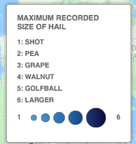
Customizable legends are another feature of CartoDB. They are styled in HTML, which has its limitations, but there are workarounds. For the purpose of this map, the legend is actually a custom image designed in Adobe Illustrator, uploaded to this domain, and then linked with an image tag in the legend editor. There are reasons why this is not ideal: if the link to the image breaks, the legend in the map breaks; changing the legend means changing the original Illustrator file and then re-uploading. Regardless, it was the best solution for the design of this map. Below is the code for the legend used in this map, as well as an alternate example that uses only the HTML editor in CartoDB.
<div class="cartodb-legend custom"> <img src="http://mediagestalt.com/assets/images/dotsFull.png">The code links to this image:
An alternate way of styling the legend to reflect both the colour and size change of the markers is to use a combination of the CartoDB legend templates with small alterations in the HTML.
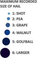
The code below styles the top half of the legend, it is a simple list that describes the size of the hail.
<div class="legend-title">
	Maximum Recorded
  	<br >
  	Size of Hail
</div>
<div class='cartodb-legend custom'>
	<ul>
		<li>1: Shot</li>
		<li>2: Pea</li>
		<li>3: Grape</li>
		<li>4: Walnut</li>
		<li>5: Golfball</li>
		<li>6: Larger</li>
	</ul>
</div>
This code styles the bottom half of the legend. It uses the CartoDB bubble preset with an alteration to style the gradient of the blue across the dots. The only drawback to this preset is that there are only five bubbles. Our map requires six different sizes of bubbles.
<div class='cartodb-legend bubble'>
	<ul>
		<li>1</li>
		<li class="graph" style="background: linear-gradient(to right,#5CA2D1, #2167AB, #11002F);">
			<div class="bubbles" >
			</div>
		</li>
		<li>6</li>
	</ul>
</div>
End Notes
The explanation and code in this document are illustrative of one way in which large data sets can be visualized. With a little bit of coding literacy, map visualizations, such as this one constructed in CartoDB, can add a lot of value to otherwise static data.
The work began on Alberta Hail Project Meteorological and Barge-Humphries Radar Archive in the late 1950’s. The data was rescued from obsolescence in the early 1990’s, and now, almost 60 years later, the data has been put to an entirely new use.
Data Citation
Alberta Research Council. The Alberta Hail Project Meteorological and Barge-Humphries Radar Archive:[computer files], Edmonton, Alberta, CANADA. Alberta Research Council [producer], University of Alberta Data Library [distributor]. August 1995.